How it works
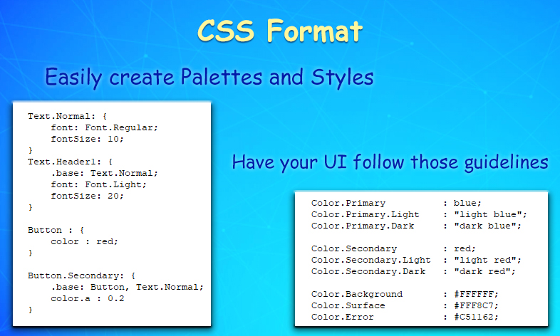
The plugin allows writing style files. These follow a format similar to the CSS files used for the Web and are used to define how each of your UI elements should look.
Styles
Basically, the styles allow modifying any variable exposed by the UI Elements and its children. That way a button style can set the image color to blue, the text color to white, with a little opacity. It can change the Font and font size and set any icon or image that its not used a shadow to have a black outline.
Styles can also be used to set constants that will be used by all other style files. For example Palette colors, Font data, etc. Using this, testing different colors in your UI become as easy as modifying a single file, and all styles and screens get updated to the new value.
Skins
Once the style files are written, they can be added to a custom skin or the default Global Skin. In the skins, there is also settings to define global styles, which are filters to determine what styles should be applied to the objects matching those conditions. This allows setting a default style for your Buttons, Text, Sliders, etc. And have them update automatically to the current skin without having to manually go to them and select the corresponding style.
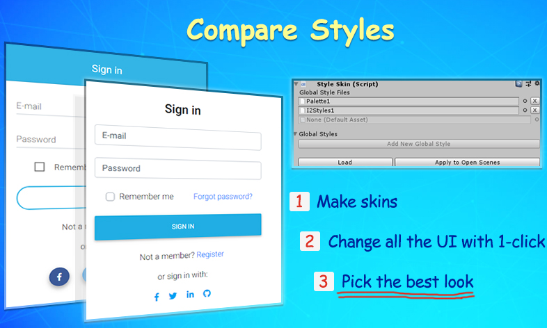
To test different looks, just create separate skins and by clicking the Apply Styles to Scene button, all the UI elements are updated to reflect the look described by the skin.
Created with the Personal Edition of HelpNDoc: Easily create HTML Help documents